ggMulthist <- function(
    upperHist
    , lowerHist
    , binWidth
    , ratios = TRUE
    , brks = NULL
    , col = c("lightblue", "lightgreen")
    , probability = TRUE
    , legendTitle = NULL
    , legendLabels = c("Upper", "Lower")
    , xlab = NULL
    , main = NULL
    , cex.lab = 1) {

  # Compute counts, which turn into bar heights ----
  # Results in a "long" data frame for ggplot
  if( is.null(brks) ){
    vrng <- range(upperHist, lowerHist, na.rm = TRUE)
    brks <- seq(vrng[1] - abs(diff(vrng) * 0.1),
                vrng[2] + abs(diff(vrng) * 0.1),
                by = binWidth)
  }

  if( probability ){
    cntOrDen <- "density"
    ylab = "Proportion"
  } else {
    cntOrDen <- "counts"
    ylab = "Count"
  }
  upperCounts <- hist(upperHist, breaks = brks, plot = FALSE)[[cntOrDen]]
  lowerCounts <- hist(lowerHist, breaks = brks, plot = FALSE)[[cntOrDen]]
  binMids <- (brks[-1] + brks[-length(brks)]) / 2
  binMids <- round(binMids, 10)
  wids <- data.frame(mid = binMids, wid = diff(brks))
  x <- data.frame(mid = binMids
                  , upper =  upperCounts
                  , lower = -lowerCounts) |>
    tidyr::pivot_longer(-mid
                        , names_to = "var"
                        , values_to = "val") |>
    dplyr::mutate(var = factor(var
                               , levels = c("upper"
                                            , "lower")))
  x <- x |>
    dplyr::left_join(wids, by = "mid")

  # GGPLOT ----
  gplot <- ggplot2::ggplot(data = x
                           , mapping = ggplot2::aes(x = mid
                                                    , y = val
                                                    , fill = var
                                                    , width = wid)) +
    ggplot2::scale_x_continuous(breaks = pretty(binMids)) +
    ggplot2::xlab(xlab) +
    ggplot2::ylab(ylab) +
    ggplot2::labs(title = main) +
    cowplot::theme_cowplot(font_size = round(14*cex.lab)) +
    cowplot::background_grid(major = "y") +
    ggplot2::geom_col(show.legend = TRUE
                      , color = "white"
                      , linewidth = 0.5
    ) +
    ggplot2::scale_fill_manual(name = legendTitle,
                               values = col,
                               labels = legendLabels)


  # Add ratios if called for ----
  if( ratios ){
    r <- x |>
      dplyr::group_by(mid) |>
      dplyr::summarise(val = ifelse(val[var == "lower"] == 0,
                                    0,
                                    val[var == "upper"] / -val[var == "lower"]))

    # scale ratios to look good on plot
    areaOfBars <- x |>
      dplyr::filter(var == "upper") |>
      dplyr::summarise(area = sum(val * diff(brks)))

    areaOfRatios <- r |>
      dplyr::summarise(area = sum(val * diff(brks)))

    r <- r |>
      dplyr::mutate(val = areaOfBars$area * val / areaOfRatios$area
                    , ratio = legendLabels[3]  # results in ratio = NA, intended?
      )

    gplot <- gplot +
      ggplot2::geom_line(data = r,
                         mapping = ggplot2::aes(x = mid,
                                                y = val
                         ),
                         inherit.aes = FALSE,
                         color = "black"
      ) +
      ggplot2::geom_point(data = r,
                          mapping = ggplot2::aes(x = mid,
                                                 y = val),
                          pch = 19,
                          size = 2.5,
                          color = "white",
                          inherit.aes = FALSE
      ) +
      ggplot2::geom_point(data = r,
                          mapping = ggplot2::aes(x = mid,
                                                 y = val,
                                                 group = ratio
                          ),
                          pch = 19,
                          size = 2,
                          color = "black",
                          inherit.aes = FALSE
      )
  }


  gplot <- gplot +
    ggplot2::geom_hline(yintercept = 0)

  gplot
}Mirrored Histograms in ggplot
In 2023, I (Trent) posted an R method for mirrored histograms. Mirrored histograms are great for comparison of proportions, or counts, across two or more samples. The mirrored histogram function posted in 2023 used base R and allowed two or more vectors to be plotted at once.
A crack R programmer (Jason) translated the mirrored histogram idea into code for ggplot, and I have to admit that the final plots look great, as most ggplot plots do. This post contains a modified version of Jason’s mirrored histogram code for ggplot.
ggplot Mirrored Histogram Routine
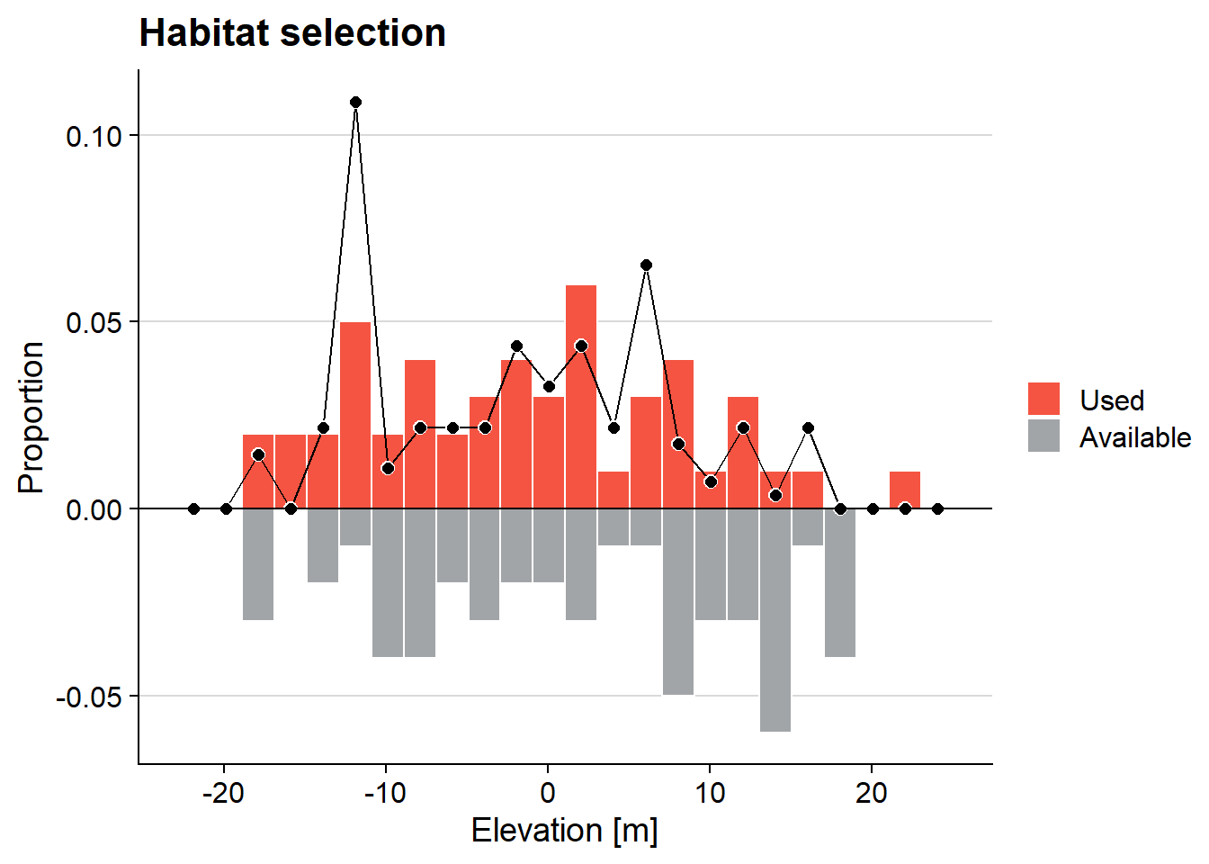
This ggplot method for mirrored histograms takes two vectors, one for the upper bars and one for the lower bars (inputs upperHist and lowerHist). In contrast to the base R version, the ggplot method takes only two vectors (modification to 2+ vectors should be simple). We use dplyr and tidyr methods to convert raw counts into a “long” data frame containing bar heights, where positive heights are for the upper histogram and negative heights are for the lower histogram. We call ggplot::geom_col to plot the bars. Optionally, we plot a line connecting the ratio of bar heights. In wildlife studies, these ratios are often interpretable as habitat selection values (McDonald et al. 1990). Packages dplyr, tidyr, ggplot2, and cowplot are required.
First the function, then some examples.
Input Parameters
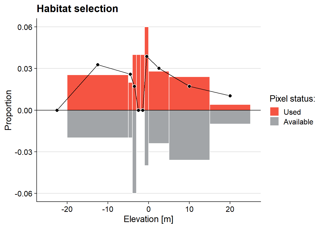
upperHist,lowerHist: vectors of observations to appear in the upper and lower histogrambinWidth: width of binsbrks: a vector of bin breakpoints.brkstakes precedence overbinWidth. Unequal bin widths are allowed.ratios: TRUE or FALSE. If TRUE, a line plotting the ratio of bar heights is included.col: color of the upper and lower histogram barsprobability: TRUE or FALSE. If TRUE, both histograms are scaled to sum to 1.0. Otherwise, raw count vectors are plotted.legendTitle: Title for the legendlegendLabels: Labels for the upper and lower histogramsxlab: Label for the x axismain: Main title for the plotcex.lab: Multiplier for font size
Examples
set.seed(234853)
s1 <- rnorm(50, sd = 10)
s2 <- runif(50, min = -20, max = 20)
ggMulthist(s1, s2
           , binWidth = 2
           , col = c("#f55442", "#a2a5a8")
           , legendLabels = c("Used", "Available")
           , main = "Habitat selection"
           , xlab = "Elevation [m]"
)
ggMulthist(s1, s2
           , binWidth = 2
           , ratios = FALSE)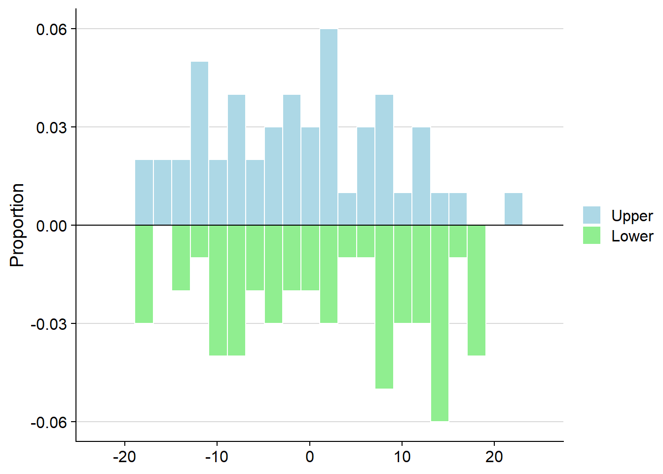
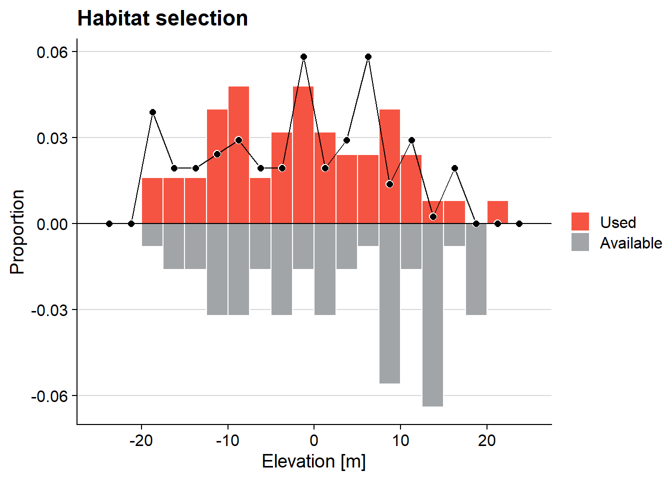
ggMulthist(s1, s2
           , brks = seq(-25, 25, by = 2.5)
           , col = c("#f55442", "#a2a5a8")
           , legendLabels = c("Used", "Available")
           , main = "Habitat selection"
           , xlab = "Elevation [m]"
)
ggMulthist(s1, s2
           , brks = c(-25, -20, -5, -4, -3, -2, -1, 0, 5, 15, 25)
           , col = c("#f55442", "#a2a5a8", "black")
           , legendTitle = "Pixel status:"
           , legendLabels = c("Used", "Available")
           , main = "Habitat selection"
           , xlab = "Elevation [m]"
)
Modifications
Relatively simple modifications, left to the interested reader, are:
- Modify inputs to accept counts, rather than raw values, i.e., change inputs
upperHistandlowerHistto be counts. This would be nice if the raw data (on the x axis) were categorical. Hint: Only lines that need modified are between the “Compute counts” and “GGPLOT” comments. - Modify the code so that “Ratios” appears in the legend when ratios are called for. Currently, the black line across the upper histogram has no legend entry nor its own axis. We worked on this one for hours, to no avail.
- Add a smoothed line to the ratios. This should be do-able via the
geom_smoothfunction. A smoothed function of the ratios is the one-dimensional resource selection function (RSF) for the resource plotted on the x-axis.
